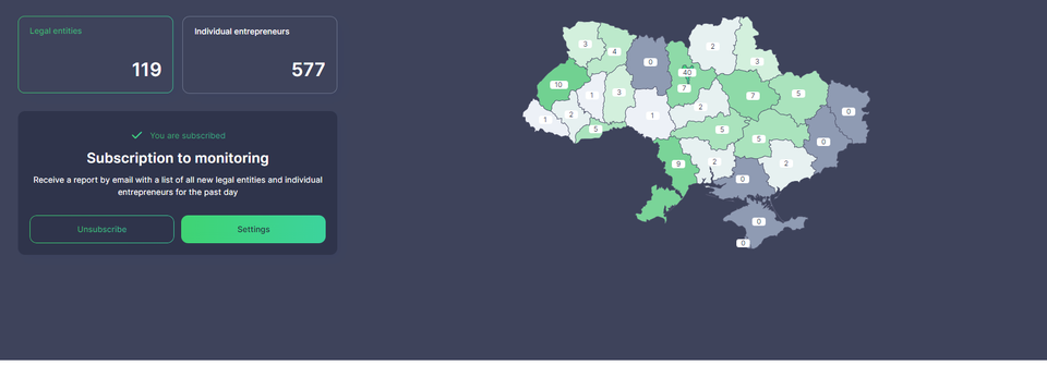
YouControl.Market has turned to the light side

Light, shadow... Symbolic concepts can acquire a special meaning, but we strive for maximum constructiveness. So, darkness and light serve our main goal: fast and efficient market research. When working with YouControl.Market, you can customize the colour theme of the interface to your taste, mood or blackout schedule.
From the very beginning, the YouControl.Market interface was dark by default. There were two reasons for this: firstly, such colours are more comfortable for vision when working in dim lighting. Secondly, the simplicity and minimalism of this interface are optimally perceived on both mobile and computer screens and meet the requirements of inclusiveness.
However, now you can choose these parameters at your discretion. You can switch between light and dark themes of the interface in one click:
